
How to Give a Room a Distinct Style – Living Room Design Plan – Design Dilemma
We’re so excited to share a new series we’re beginning on our YouTube channel called Design Dilemma! Every month, we’ll share design dilemmas submitted by readers and create design plans that solve these problems. We’re super excited about this because we feel like these solutions will help so many create a home they love.
DILEMMA ONE: NO IDENTITY
Our first design dilemma is submitted by my friend Elizabeth. She said, “My living room really is a mashup of new things/old things/things from college. It has no identity.“
I love kicking off with this one because I feel like a lot of people feel this way. It’s easy for our homes to evolve through the seasons of life, but sometimes the evolution doesn’t bring a distinct style or really look finished. If you feel this way you’re not alone and we have a solution.
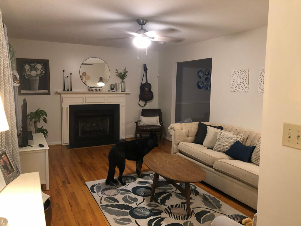
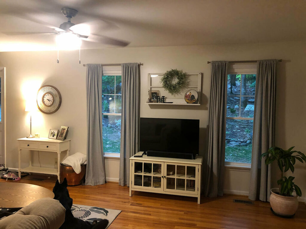
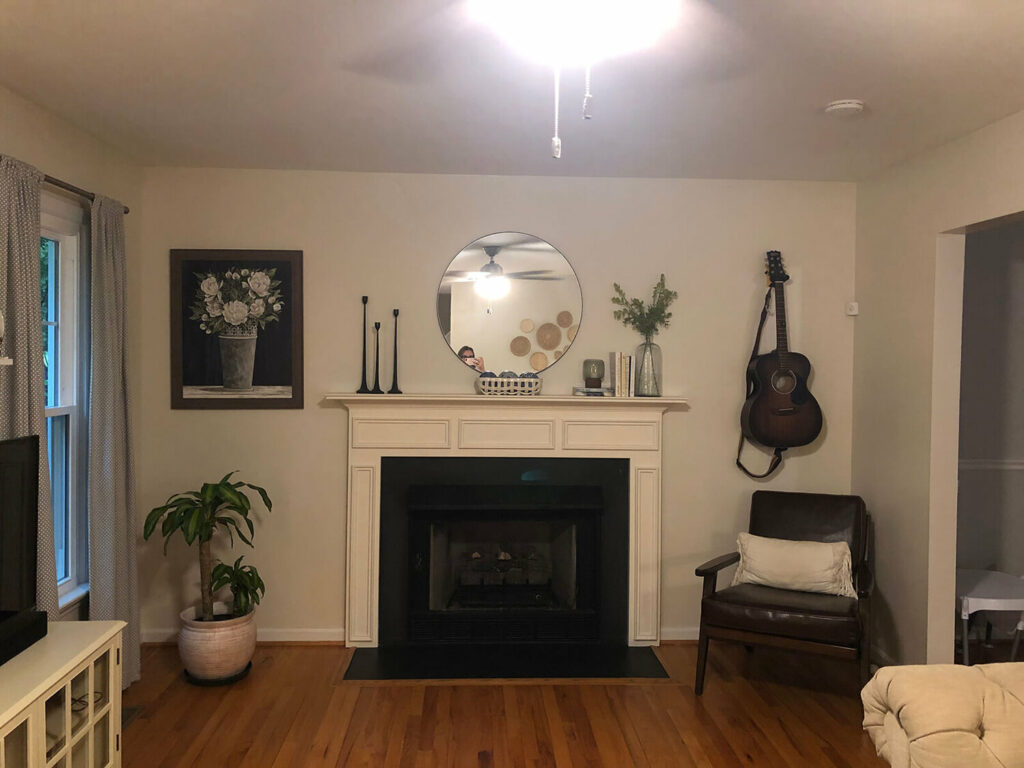
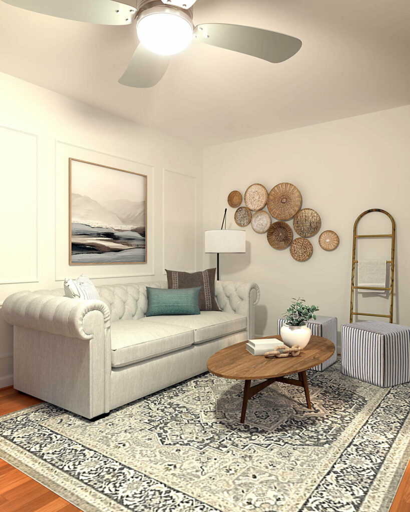
LIVING ROOM BEFORE
Here is Elizabeth’s living room. Right now it’s hard to decide what to call the style of the room. There are cute little vignettes but they don’t flow together and give a complete finished look. No need for a blank slate or a big budget here. All this room needs is an intentional refresh.
Let’s start with my initial thoughts on her room and then we’ll make a mood board and I’ll share the entire room mocked up!
MY THOUGHTS ON THE PROBLEMS IN THIS ROOM
- SCALE – Her issue in this room is scale. The art above the couch is too small, the plant next to the fireplace is too short, the art next to the fireplace is too big and the rug is too small. Scale is such a common problem. Luckily it can easily be solved by moving things around
2. NO DEFINED FOCAL POINT – Drawing attention to the fireplace would make the design feel so much more polished and intentional.
WHERE TO START IN A ROOM THAT FEELS UNFINISHED
Let’s start by stripping everything back and defining a focal point. Ask yourself what adds the most character to a room and what brings you the most joy. For me, in Elizabeth’s living room it’s her fireplace. The trim work is so in style right now and adds a sophisticated touch to the room.
When trying to label Elizabeth’s style I feel like the best label is Modern Traditional. Her chesterfield sofa gave that sophisticated traditional feel and the chair in the corner and the coffee table brought the modern touch. I decided to find a look that tied these pieces together with a bow. While it may sound like a bit of a contradiction, I love seeing traditional pieces brought together with modern touches. Sometimes you just like both 😉 This is why making a mood board is important because it can give you a clear view of what will look good together.
Remember you don’t have to have a title to your design, but it can be super helpful to give a space an identity that feels like home to YOU! If labels make it hard for you to move forward in your design skip them. If they don’t then embrace them. For me, they are very helpful but also don’t box me in with so many creative examples online.
Here is my design board for the room. If you’re looking to make your own board Canva is a great tool to do so. I have a more detailed post about how to do that here.
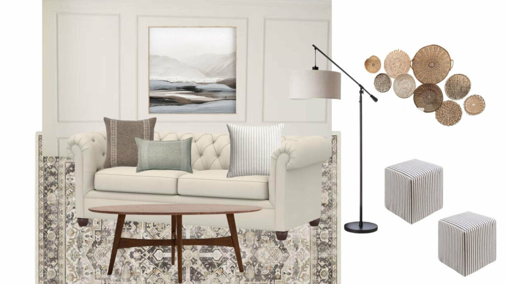
You can see I used almost everything Elizabeth had. This was a request of hers so I did my best to make it all work together. You’ll notice one thing I replaced…the rug. In her message, she noted how she really wanted to keep the rug because of its function. She loves the look and it’s a washable rug from Ruggable. Those pet lovers know how important everything being washable is.
The rug is just simply too small. Rugs that float in the middle of your living room without the furniture pieces on them don’t give a finished look. We’re looking for at least the feat of the furniture to be on the rug. Luckily I found one from Ruggable that fits the design and she can get the correct size.
A typical area rug size for this look in a living room is an 8′ x 10′ rug or larger. If you aren’t sure measure out your desired rug size with painter’s tape to get a sense of how it will feel. We promise it’s a lifesaver. Make sure your rug is at least 6″ wider (8″ is ideal) than your sofa on both sides.
PRO TIP: There is a solution to having the wrong size rug – layering rugs!
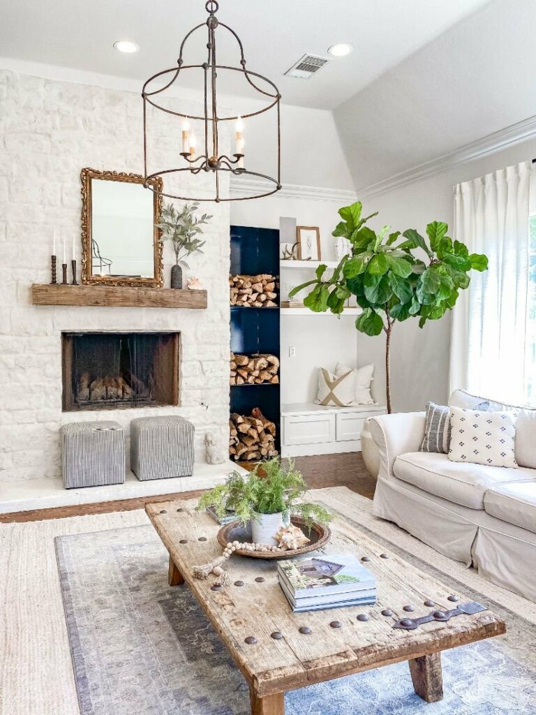
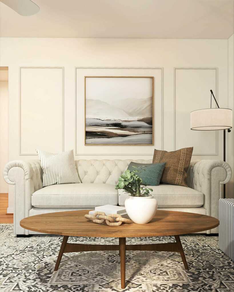
FINAL LOOK
Here is the final look mocked up. You can see it looks clean and well-designed. It also has all the functions Elizabeth and her family are looking for. Let’s talk about those final details.
ACCENT WALL
When Elizabeth reached out to me she told me she was having trouble finding something to go over her couch. Adding this trim work is an easy cost-effective DIY that fills the space and is a great call back to the trim work on the fireplace. I love how it looks layered with this gorgeous art I found on Etsy. I found a DIY showing how easy this trim work is. Elizabeth and her husband Brandt DIYed their own backsplash in their kitchen so I knew they’d be able to take this on themselves.
BUDGET DESIGN TIP: Finding art that has a digital download is often more budget-friendly than art sold already printed. You can print the canvas online at the size you need and DIY the floating frame yourself.
DRESS UP AN ODD PLACED TV
Often the last few details really make a room feel well designed and completed. For Elizabeth, I’d say mounting her TV is one of those final touches. The TV’s placement between two windows is not my favorite place, but this placement is the best function in this room. Luckily today we have so many amazing options to disguise an unsightly TV. One of those is the Frame TV which I’ve mocked up here. They can be a little pricey, but so many bloggers have come up with more cost-effective ways to get the look. One of my favorites is Jenna Sue’s DIY.
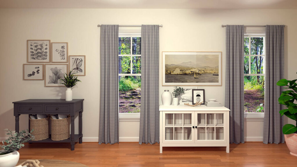
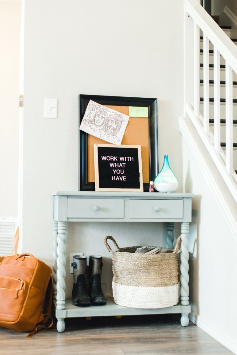
DEFINE THE ENTRY AND ADD FUNCTION
Another thing I suggest is painting the entry piece. The entry piece and the tv stand looked too similar and didn’t give the design pop that the room deserves. I suggest using the color Graphite from Jolie Paint. We also added a family gallery wall over the table. The black and white photos are a really clean way to add a personal touch to a home.
We solved another problem Elizabeth had with shoes piling up in the entry. We simply added baskets under the table. It tucks them away and gives them a dedicated storage space without having to walk upstairs to put them away. Never underestimate the power of a basket—Pretty and functional!
FIREPLACE DETAILS
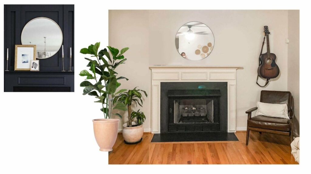
We loved Elizabeth’s fireplace. We didn’t change very much. First, we took down the art over the plant. It felt cluttered and was competing with the mirror. We added a few small accessories to the mantle with the existing mirror she had. If you’re ever struggling to decide on an accent piece for a wall, a round mirror is almost always a good choice.
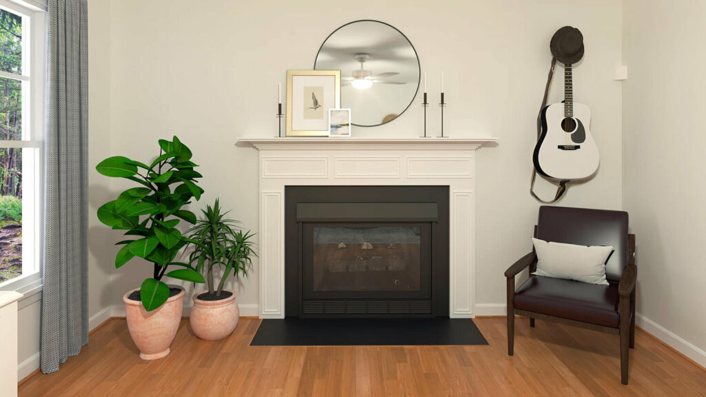
Elizabeth said her husband Brandt’s guitar had to stay on the wall. I think she thought I was going to push back on this but honestly, I love the look. It adds so much personality to the space and looks great with the chair in the corner. I feel like lots of memories are made around this chair and fireplace with that guitar.
Another thing Elizabeth wanted to keep was her corn plant. I totally get it. I’m a plant lady, but the plant is simply too short for its location. Luckily pairing it with a taller tree, like a fiddle leaf fig completes the look and makes a plant lady happy.
SHOP THE LOOK
If you’re looking to complete a similar look here is the shopping list for the design.

Thank you, Elizabeth and the Mitchell family for giving me an opportunity to design your living room. I hope you love it and feel like it’s something you can take on to solve your design dilemma.
If you’d like to submit your own room for a design dilemma use the link here. Every month we’ll be choosing a space that we feel helps the most people!