Hunting Color Inspiration for Home — Dallas Scavenger Hunt
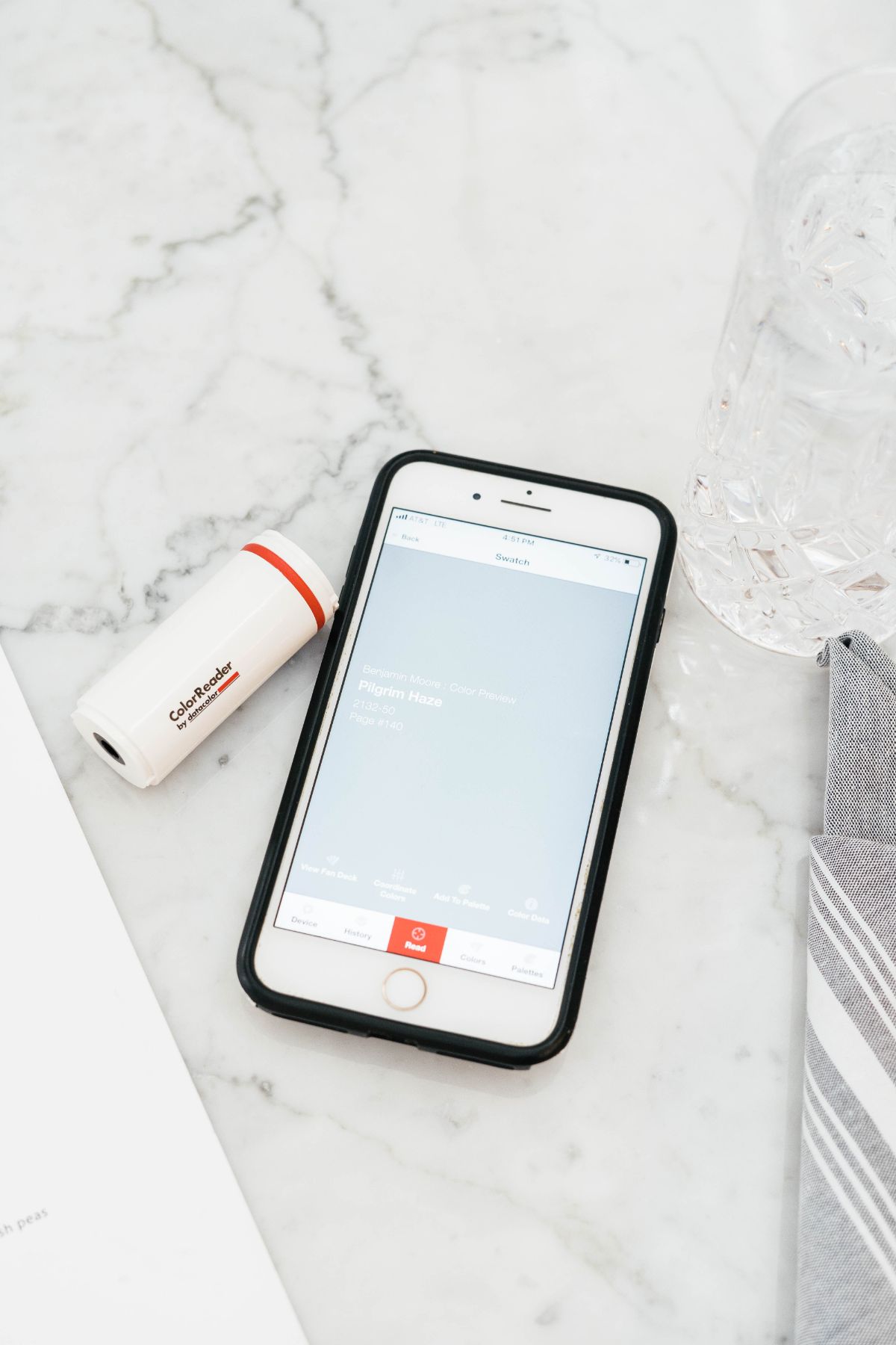
Today we’re so excited to be sharing our Dallas Color Scavenger Hunt with our friends at ColorReader! Picking a color can be such a challenge. I’ve found myself inspired by color when I’m out and about and having to guess what color that is when I head to grab paint samples. ColorReader is an amazing tool that allows you to scan an object when your out and it shares the colors from all major paint brands. We’ve taken this tool out in Dallas to hunt the best neutrals, bolds and most inspiring colors!

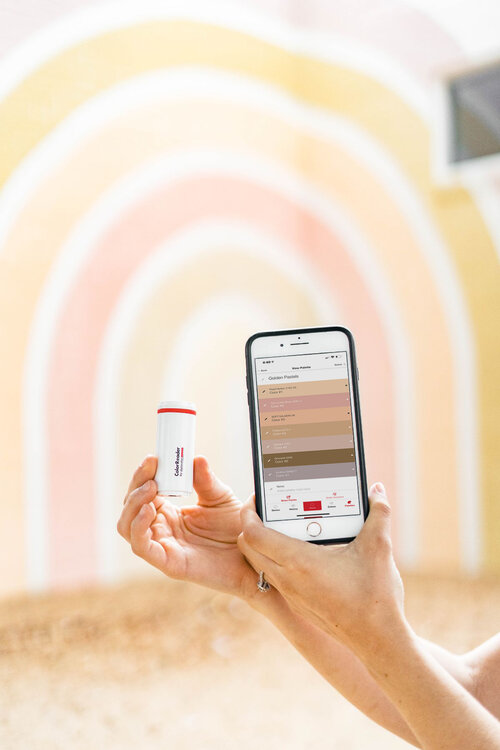
The ColorReader app allows you to organize palettes so you can go beyond finding color inspiration for paint. You can keep your palettes on hand when you’re shopping to make sure your accessories and furniture coordinates. While strolling around Dallas we made 6 Color Palettes including:
- Golden Pastels
- Cool Tones
- Moody Neutrals
- Warm Tones (Autumn Inspired)
- Bold Tones
- Soft Neutrals
We’ve created a Pinterest board for every color palette to pair each color that inspired us on the scavenger hunt to the real design examples. Make sure to look out for the links for the inspiration!
GOLDEN PASTELS
One of my favorite spots for color inspiration is Deep Ellum. It’s a very creative district with unique stores and restaurants. We kicked off and created our Golden Pastel pallet almost completely from this wall mural we found at a local shop- Flea Style. This rainbow includes almost every color that inspired me for our nursery project. Surrounding this mural was even more inspiration!

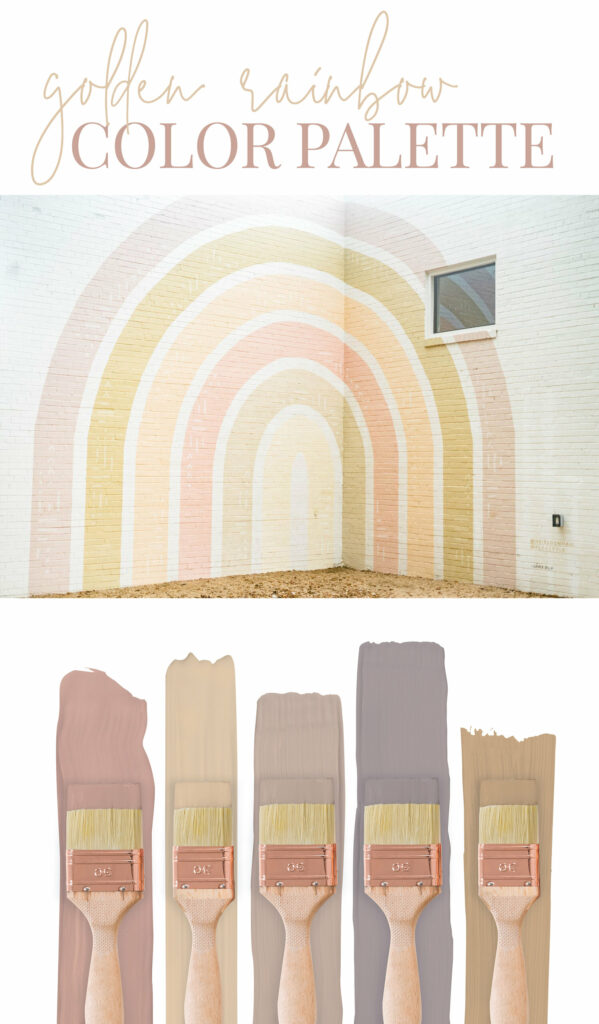
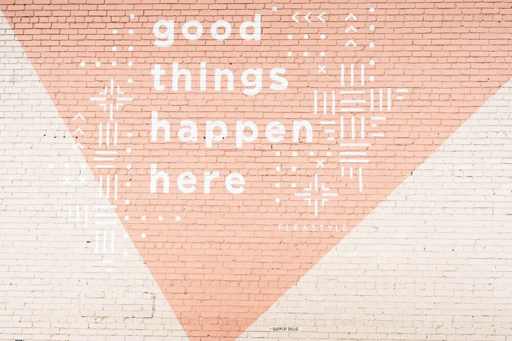
I love this palette because it’s so playful and fun. It’s been so fun seeing blushes and golds used in every day design rather than just spaces for kids. My favorite color in this palette is Terra Cotta Blush from Valspar. I’d love to see a room painted in this color!
More Golden Pastel Color Inspiration on our Golden Pastel Pinterest Board.
COOL TONES
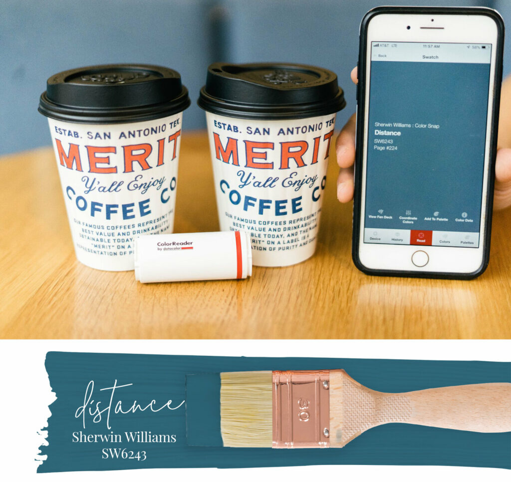
We stopped for coffee and found more color inspiration at Merrit Coffee. Their shop is full of cool tone inspiration. This blue scanned on the ColorReader app was Sherwin Williams Waterloo. It’s bold but timeless. I’d love to use this color for kitchen cabinets! Maybe even a two toned with the top white and the lowers Waterloo. Who wants to give it a go?
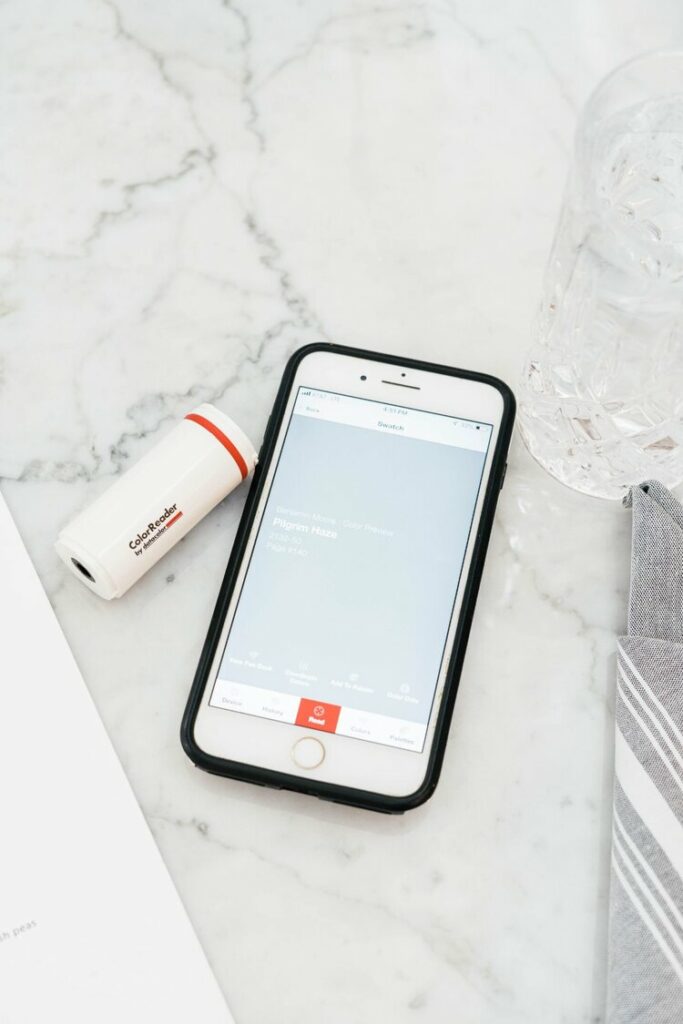
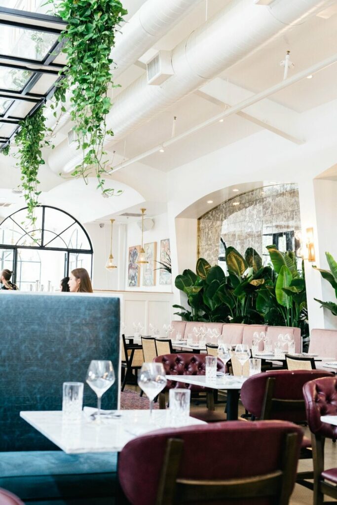
We found more cool tones and great food at The Henry—one of the most well-designed restaurants I’ve ever been to. From the inside and out every detail was inspiring and I was so glad to have my ColorReader on hand. The Henry’s exterior was an amazing gray that contributed to our soft neutral pallet—Benjamin Moore’s Ashland Slate. This is a great home exterior color if you’re hunting for one whether you’re painting brick, siding or even stucco like The Henry’s exterior.
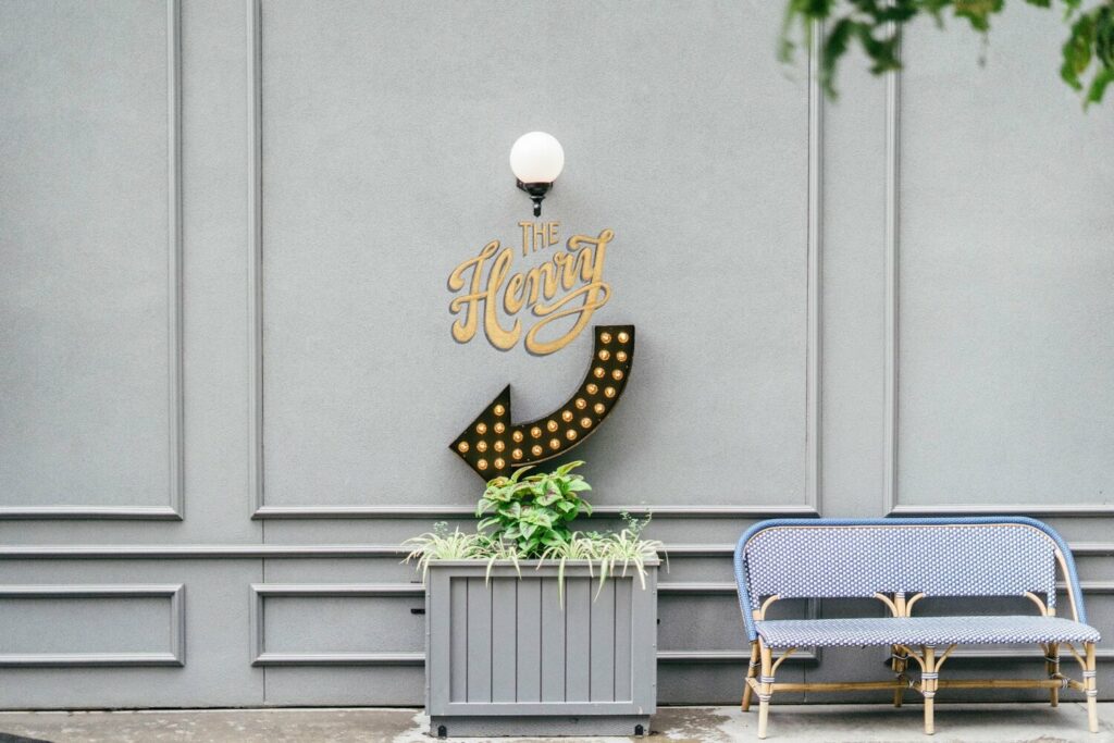
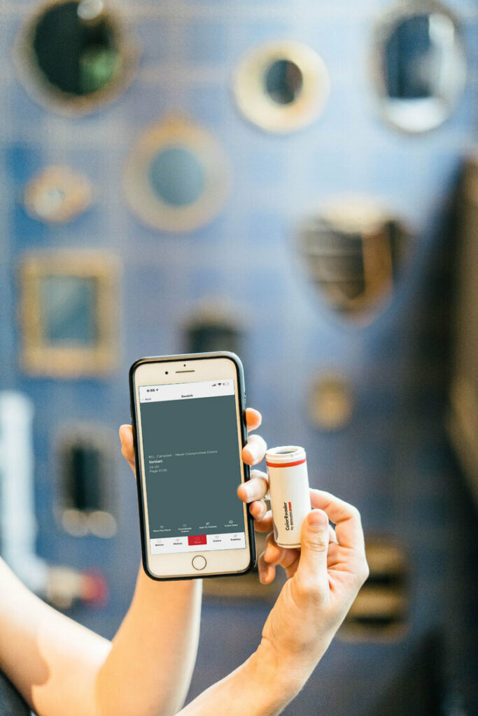
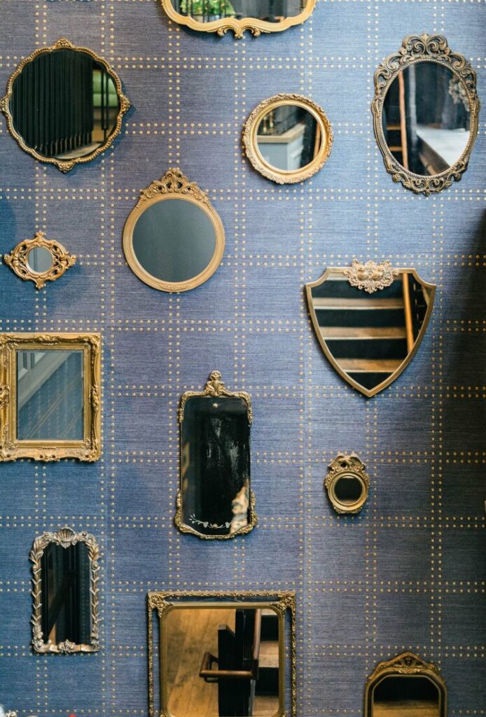
Inside The Henry, this bold wallpaper scanned a bold blue that pairs great with gold. It’s deep and sophisticated, but playful at the same time. I was also inspired by the collected gold mirrors. I’m currently trying to find a wall in my home that gives me an excuse to hunt down vintage mirrors.
More Cool Tone Color Inspiration on our Cool Tone Pinterest Board.
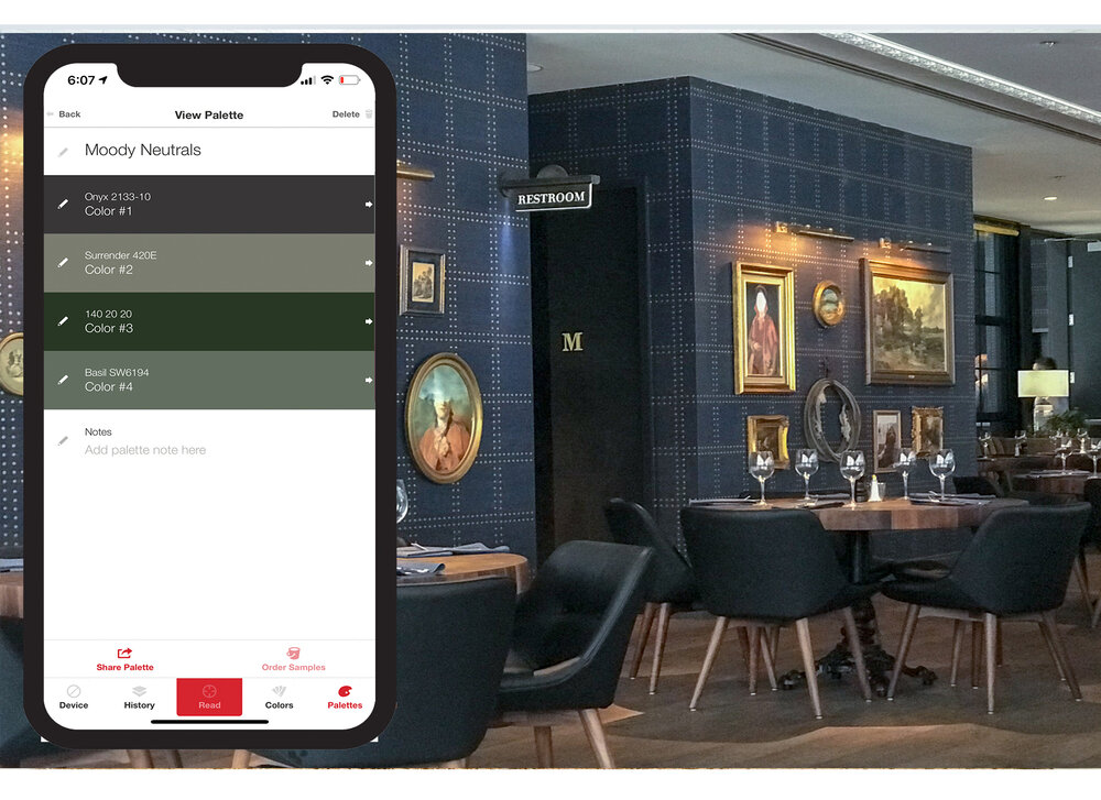
MOODY NEUTRALS
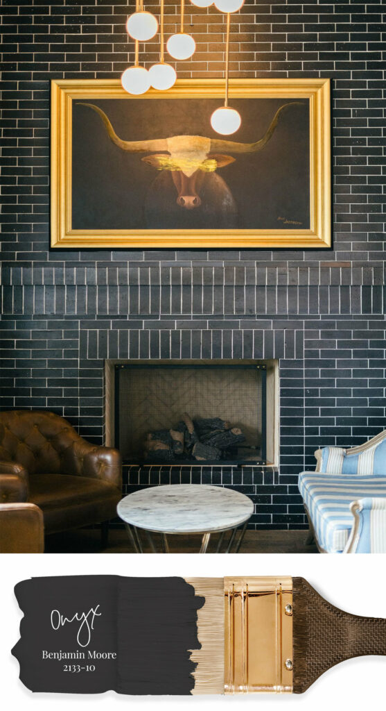
Also at The Henry, we found the most gorgeous fireplace upstairs that was a great black—Benjamin Moore’s Onyx. It’s an beautiful black, because it’s not too stark yet the undertones don’t show too espresso, green or navy as we’ve seen pretty common with other black paints. This fireplace inspired us to create a Moody Neutral palette on our scavenger hunt.
Moody Neutrals are tones that bring an edge to the space and are very much in style right now. From blacks and charcoals to deep greens. They are neutral, but the statement they make is bold. I added a tone of greens to this palette because I’m currently obsessed with them.
More Moody Neutrals Color Inspiration on our Moody Neutrals Pinterest Board.
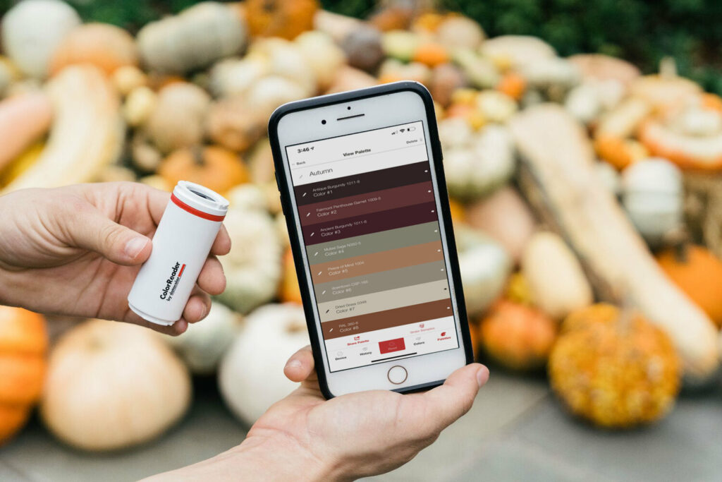
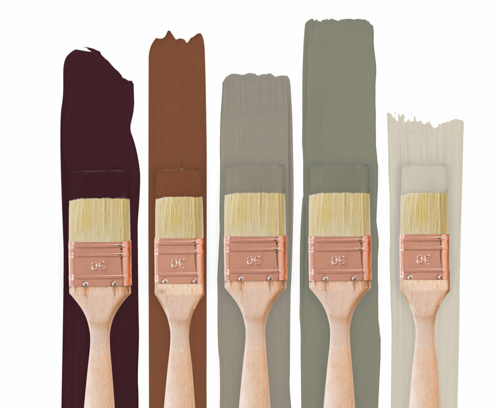
WARM AUTUMN TONES
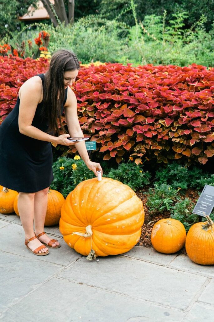
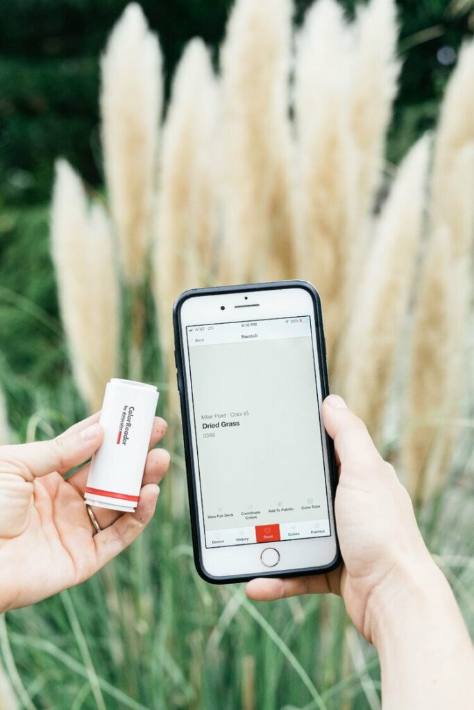
My favorite place to find design inspiration is nature! Nature offers bold and neutral tones that are timeless. For this inspiration we went to the Dallas Arboretum which was perfectly decked out for fall. We created our entire Autumn palette here simply with a pile of pumpkins and flowers. Our palette ranges from burgundies to golds and olive tones. Behr’s Muted Sage was one of my favorite colors we found here.
While we created this palette with the season in mind it is useful once fall is over as warm tones are so in style right now. I’ve loved seeing cinnamons and burgundies incorporated into homes. It seemed to go from cool grays to all warm colors over night, but I love the cozy feeling it brings to a space.
More Warm Color Inspiration on our Warm Tone Pinterest Board.
BOLD POPS OF COLOR
We love a BOLD color used for a statement wall in a home, but bold colors are often the biggest challenge to find the perfect one. We went to the Bishop Arts district to source the best bold colors and boy did it deliver. We scanned storefronts, wall murals, and even stopped in for another bite to eat to find more color inspiration. The restaurant Paradiso gave us both bolds and neutrals.
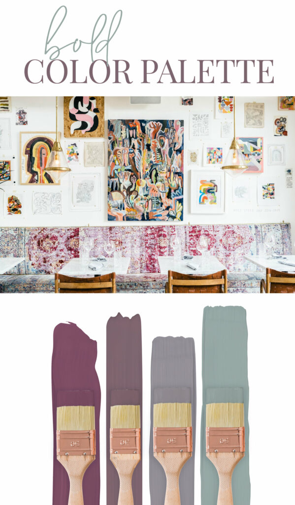
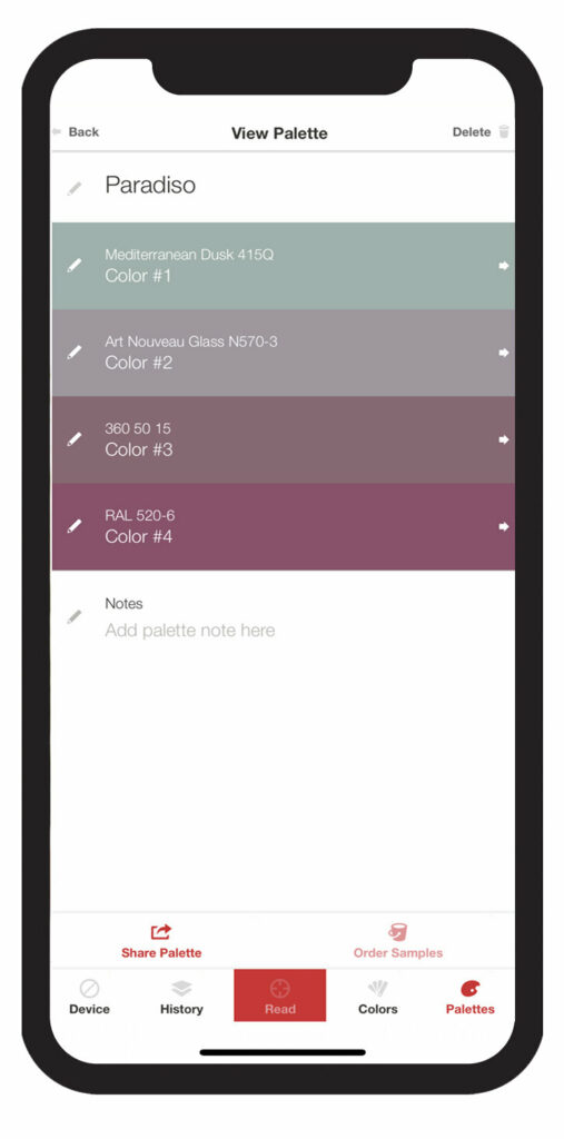
I love seeing design where people take risk with color in a world where neutral is in style! The upholstery on the bench plays off the art above with tones of magenta and blue. It’s a fun mix that I never cold imagine working so well. I’m loving the color Mediterranean Dusk from Valspar. I’d love to use it on a vanity cabinet! The other colors were Art Nouveau Glass from Bher, 360 50 15 from RAL, and 520-6 from RAL. RAL Colours was a new brand for me and I loved finding it with the ColorReader.
What I loved when using the ColorReader to source bold colors was using the tool not just to find paint colors but to think about tones that work together in general. I could now use this palette to find fabric, accessories and other design elements for a space. It’s helpful for so much more than just matching paint colors!
More Bold Color Inspiration on our Bold Pinterest Board.
SOFT NEUTRALS
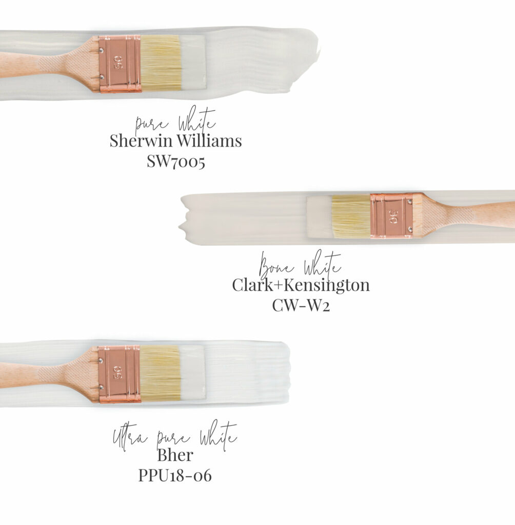
And here is the palette that grounds them all—soft neutrals. This palette includes whites, beiges, grays and any light neutral color. We found these tones not only on walls, but in marble counter tops and even plants. Our top three whites that we felt could and should be used in a gorgeous home are Pure White by Sherwin Williams (used in my home), Bone White by Clark + Kensington and Ultra Pure White by Bher.
With white being the most trendy color right now I loved finding inspiration for the tones it could offer outside of highly edited photos on the internet.
More Neutral Color Inspiration on our Neutral Pinterest Board.
The ColorReader has been not only a practical tool, but so much fun for take out for a color scavenger hunt. It’s perfect for anyone from the design enthusiast loves to be inspired while out and about to the person who simply has trouble picking color. We’ve found that the product is so accurate. We scanned our walls and it gave us the colors that we painted plus similar colors from other brands.
We’d love to hear where you love to find color inspiration and what your favorite colors are in the comments below! Also, if you use any of these paint colors in your home we’d love to see photos. You can purchase the ColorReader here and learn more about the product. I have kept mine on me ever since I received it and it’s a constant reminder to keep my eye out for inspiration.